 27 Nov 14
Aequitas
With Desktop Dungeons making the move to mobile, we’ve had to spend a considerable amount of time optimizing it to run on lower spec hardware (yes, some of our initial code is … inefficient …), but we’ve also had to take a long, hard look at how players would interact with the game without the ability to mouse over something.
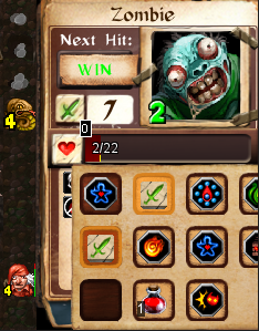
We can’t have you simply click on an enemy to attack it, since in DD knowing how much damage you’re going to do (and take!) is essential. Unfortunately the way our current ‘selected’ enemy panel works just doesn’t take mobile into account.
So we’ve decided to redesign it.
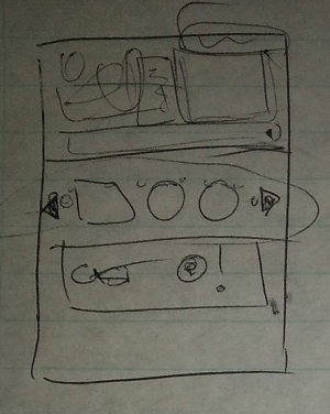
Early on in the redesign, we realised we needed a two step process: Select Action, and then Do Action. This let’s you see what the outcome of doing the action would be, including damage taken, mana spent, etc. You know … like DD does right now when you mouse over an enemy. So all our designs had some sort of ‘Action’ button.
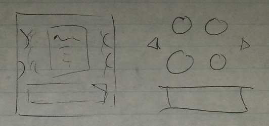
We toyed around with various ideas of smooth scrolling lists, and action buttons. We put things where the enemies currently display their effects, and we mentally played the game in different situations, to think about how it would handle.
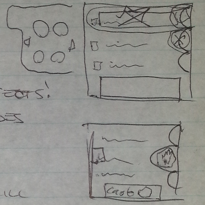
In the end we settled on a ‘drawer’ that could be pulled out from the side of the screen, giving you all the in-combat options you might want. It doesn’t obscure the enemy status effects all the time, it can pull out as far as is necessary to show you all your options, and we even built in some ‘quick use’ slots that you can access without pulling the drawer out.
Once we actually get time to throw some art at it, I think it’ll look as good as it feels to play with.
20 Nov 14
damousey
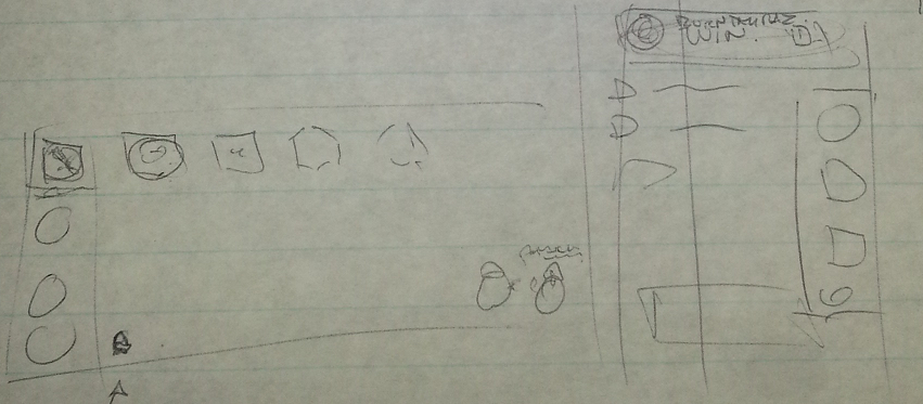
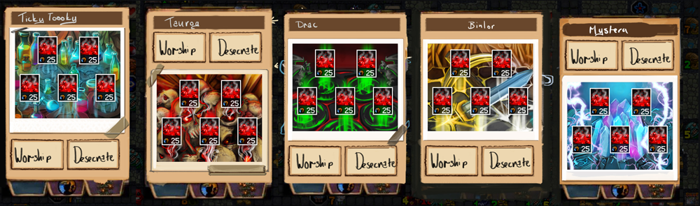
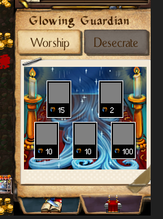
We’re hard at work on the monumental task of getting Desktop Dungeons to mobile platforms. A large part of this is re-approaching whole chunks of the user interface (UI) and reshuffling the information to deliver it more cleanly, particularly without mouseover information. Specifically things like the altar panel, that window that pops up to select and compare boons when you’re worshipping a god.
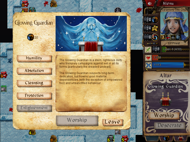
Aaaand that is one of the problems; it’s a pop up. It’s the only large, dungeon-obscuring, pop up of interaction within the dungeon experience. When we originally built it, this didn’t seem like too much of a problem. This panel has a lot of information and you’re comparing several items to each other; there are effects, prices, and interactions to consider. We built it large and added that sweet portrait art to flavour it accordingly. I’m not even sure if we knew it would be the only time we used this large pop up to deliver information when we built it. Either way, over time it has grown into a pet-hate, so while we’re under the hood, we have to take the chance to make it better; deliver this information smarter.
Making UI smarter is not easy; reorganising information in an information-heavy game like this, particularly with the tight size constraints that we have in place, can be pretty intensive. It takes more iterations to achieve smarter design; balancing flavour against essential information, determining which aspects are really critical and which aspects might be summarized visually. Should the altar be made of stone? Can we fit the boon names in less space without making it feel like just a list? Can we integrate it into the book effectively?
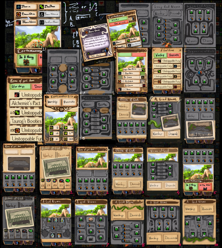
So we explore this visually as well as conceptually until we settle on a design that works. Then we proceed to make it pretty with artness (the icons for the individual boons are still in process, excuse the placeholders.)
Which also goes through a couple of iterations of refinement.
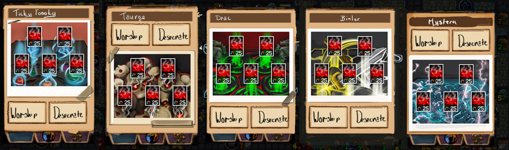
Until eventually we’re happy enough to build it in game.
I imagine there must be people for whom this process comes more intuitively, designers who have less of a process of elimination in their process. UI is one of those areas of design that becomes more intangible and invisible as it gets better. We’re not there yet, but we’re significantly closer than we were.
