31 May 13
Nandrew

Burnt Toast

blogImage-2013-05-31

This week, we’ve put a fair bit of art oomph behind more of the Kingdom graphics. Aside from completing the building sprites (woohoo!), we’ve also revised the quest toast system as shown above. Instead of disjoint boxes and confusing scroll rules, you’ll enjoy a neatly presented banner announcement with all relevant completion info and delightful colours in just the right places. Because you’re worth it.

This week also sees the introduction of yet another dungeon control scheme: if you’re interested in trying it out, switch to the Classic combat scheme via the in-game menu and right click on any accessible enemy for a persistent interaction panel. You’ll be able to wander around, whack other monsters and do dungeoneering stuff freely while keeping that tab handy. Fiddle about, let us know how this compares to the other stuff and report bugs wherever you can – because we’re sure there’s tons of ‘em.

Though this has been true of the past few weeks, we’ll mention again that this is a big interface and graphical update. Check the changelog below for details, and enjoy this update’s new eye candy! More…

24 May 13
Nandrew

New-Age Combat

blogImage-2013-05-24

Welcome to the modern era of gaming! In a supreme flush of forward thinking and divinely-inspired game dev smarts, we’ve implemented an alternative UI for enemy engagement, giving players the option to select a foe and kill it with the help of a quick options menu instead of the classic DD fighting style. Great for mouse users and surprise-click death victims!

The old Kingdom continues to be erased in favour of newer, more accessible interface panels. Information now flows throughout the screen like a unique solid/liquid hybrid of manna and ambrosia. Word has it that next week we’ll be seeing the final round of art for Kingdom buildings, too. Hooray!

This week’s blog post is short and sweet, as we continue to focus on interface changes and improvements. We’ve struck at one or two bugs where possible (including that pesky Gaan-Telet dungeon generation error), so check the changelog for details: More…

23 May 13
Aequitas

Where art and information collide

Kingdom Gold

As is evident by our last few updates, we’re currently making a real push to polish off the interface in DD. I’m sure any coder can tell you that this is not ‘fun’, but it is necessary. You need your interface to convey all the important information players need to make decisions, but at the same time, looking at a page of numbers that resembles an excel spreadsheet is not compelling. So you do your best to group the information and present it in an elegant way, while your overworked artists finish off a different part of the game.

Soon enough we’ll turn the artists loose on the game’s information displays. They’ll do some mockups of how things could look, and there will be some back and forth as they try to make your horrible layout choices look great, while keeping all the relevant info visible and accessible. After that, it’s importing all the art assets into the game (trying to squeeze as many of them as possible into a single sprite sheet), and then integrating the art and the info so it looks as good as the mockups, but is still dynamic.

We’re going for a particular look with the DD Kingdom. We want you to feel like the administrator, leafing through papers about which buildings are in need of upgrades, which trophies are lacking, and filling out/approving permits for the latest adventurer who wants to try their luck out in a dungeon. Up until now, we’ve always made the ‘adventuring permit’ the default side panel for the Kingdom, and while this serves a fine purpose for letting players navigate choices of going on an adventure, it’s not really necessary while just administering the Kingdom.

This week you’ll get the first look at the admin backing panel. We’ll add more stuff to it in the future, and once the artists get a shot at it, I’m sure it’ll look a lot nicer. In the meantime though, it gives you a definite feeling of separation between administering your Kingdom, and preparing a brave adventurer for their impending death.

17 May 13
Nandrew

Trailblazing

TrailsIt’s somewhat satisfying whenever we wipe out the more uggo elements of the old UI in favour of newer, sleeker and more accessible systems. The Kingdom continues receiving love on all fronts, helped along generously by user reports which let us work out the kinks that much faster.

This week, we’ve been putting our work into the default Kingdom and map side panels, both of which have been in sore need of updating for quite a while. The obsolete information displays and quest listings have left the scene, replaced by stuff that’s easier to use and much friendlier on the eyes (our Kingdom Advisor panel will be making a return later in a different and much more impactful form).

We’ve also managed to properly implement regeneration trails in-dungeon, which is a huge relief for us. As it turns out, teaching people about the marriage of exploration and regeneration is a rather thorough exercise in pulling teeth. Visually reinforcing where one’s health comes from – and where it ends up – is one of our most vital weapons in the war of understanding. Perhaps we’ll write a post sometime about common gamer expectations versus departures from the norm, because this issue alone has given us more pain than third-degree burns at a salt convention.

The radial menus mentioned in this week’s dev blog aren’t in the game yet, because we want to polish them a bit more (not much use giving people an alternative interface yet if it’s not 100% convenient to use, right?).

Aside from one or two changes which could be considered bug fixes more than anything else, we don’t really have much in the way of balance adjustment for you this week. Graphical improvement, however, marches proudly on. Changelog follows: More…

16 May 13
Nandrew

Alternative Interfacing

2013-05-16radialImage


Long story short: the above mouthful of a title is just our fancy way of saying that DD’s gonna get some cute little radial menus soon. Booyah!

This has been a long-time goal of ours for two reasons. One: we’ve always been meaning to build menu systems that are slightly friendlier towards touch interfaces (because, you know, we haven’t forgotten about that huge mobile fanbase awaiting us on release). Two: among the crew at QCF, I’m pretty sure I’m the only one who still insists on using pure mouse controls when playing the game. Seriously, I’ve broken the hotkey system about two or three times without even realising it because I really just don’t give a crap about that part of the game (very sorry, keyboard fans — one of the other devs will probably step in and give you those highly sought-after arrow controls before full release, though). More…

10 May 13
Nandrew

Amulet of Clarity

blogImage-2013-05-10This week’s an interface update, folks. The most noticeable change is the movement of building panels into the Kingdom’s sidebar, which involved a fair bit of code reshuffling to make the new system work as intended (you may read that as code for “here be dragons and / or uncaught bugs”).

As those of you who read our blog post on the subject are already aware, we’re trying to get certain tasks and game areas done and dusted in a very definite manner. We’ve already abandoned most trivial balancing concerns (favouring user interface and player expectation problems) and we’d like to get the Kingdom locked down soon, too. Expect regular poking at that over the next few weeks.

Since the changelog generally does a good job of explaining what already IS changing, we’ll mention here that the coming weeks are also going to see more changes made to the in-dungeon interface, mostly related to combat interactions and supporting animations for “everyday” stat adjustments.

We’ve been receiving a lot of feedback from new players recently about their experiences with the early stages of DD. Our thanks to all of you – even the horribly confused ones. Especially the horribly confused ones.

Slowly but surely, our Kingdom is winning the war against its greatest and most long-standing nemesis: poor UI. The changelog that follows chronicles just one battle in this epic, years-long conflict: More…

09 May 13
dislekcia

Getting shit done

You always have to be prepared to look at what you’re spending your time on during a game project and ask yourself: Is this really necessary?

This is doubly true of a project that’s got a budget and a limited runway in terms of when you can afford to still be working on this thing… So during a some recent time off during a public holiday, inbetween trampolining and exploring the mountains along our south coast, I had the chance to take a step back from the work-face and consider a few things.

The biggest question: Is the Kingdom worth it?

Specifically, is the graphical representation of the Kingdom in Desktop Dungeons worth it? It performs fine as a progression menu in the game, it gives players meaningful goals and manages quests, etc. That’s all great, but do we need it to look as detailed as we’ve been trying to make it?

The background on the Kingdom’s “new look” (which to us isn’t new at all) is that Lurk first drew a few Kingdom concepts back in the early days of us starting to work on ways to expand Desktop Dungeons into something better than the free alpha. His concepts were great and quickly got us thinking about a lush field, full of upgradable buildings and quirky little touches. The idea totally blew away the alpha’s ugly starting screen with its incomprehensible options, but the sad truth is that the actual Kingdom menu that had been in the beta for so long was the result of us crunching like mad to get the game playable before GDC 2011. It was, as many of you know, another ugly collection of (often incomprehensible) buttons…

We only recently managed to replace that menu with something resembling the Kingdom concepts of old, why did it take us so long? Well, it turns out that getting all that art to play nicely with progression is incredibly tricky. Finding an artist that could take on Lurk’s singularly detailed painted style was one thing (Hi Dorianne!), but we also had to do a lot of engineering to make it work the way we wanted it to.

I spent 4 months on a tool that would allow Dorianne to work on the Kingdom in a similar way to how she’d worked wonders with the tilesets. We had endless back and forth sessions on what individual buildings should look like and how they interacted with their neighbors from both a graphical and functional perspective as a sort of stealth menu. And it’s worth noting that this wasn’t an acrimonious process! We were all pretty happy with everything, it was just taking forever. It didn’t really matter that the buildings and their upgrades were all written up in the game’s design wiki years ago, things had to be concepted, painted, re-sampled to lower resolutions, touched up, polished, re-drawn, transferred to polys, integrated into display groups, logically tied to mouse actions and put into the overall progression before they were even viewable in the game. Yes, the LayerSet editor allowed us to do WYSIWYG edits, but that mostly resulted in tons of re-drawing and polishing, which took up tons of time.

Time which we’re starting to have problems affording.

So, the question burned away while I was trying to remember how to stop pulling to the right during backflips: If we don’t have the fully-featured Kingdom we see in our heads, what takes its place? Once I got back to the office, I lobbed the same question at Marc and we tried to be as ruthless as possible. We decided that we needed to have the Kingdom done and dusted by the end of this month. If that meant going with a simpler, less rich version of the Kingdom screen that was essentially a skin over simpler buttons, so be it. The deciding factor would be how efficient we could get with the production of the Kingdom we really wanted, so out came the big lists of stuff that needed doing and we crunched at that until we had a critical path.

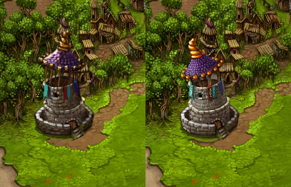
We presented Dorianne with both options, the cut down Kingdom as a recovery plan if we didn’t get far enough on the full thing’s milestones this week and next. Dorianne told us how we could help it all happen faster too and a significant chunk of my time has moved from coding to managing art… How are we doing so far? Well, I’ll let you judge for yourselves:

magetower2-progress


03 May 13
Nandrew

Rex Effex

blogImage-2013-05-03

This week is heavier on bugfixes again, but we’ve made a few interface and design tweaks according to recent player concerns (don’t get too excited about balance though, we’re keeping our interference super light on that from now on).

The new effects icons should start rolling out this week, and will continue doing so for a while (you may remember us teasing the concepts for those in previous blog images). We’ve also got more significant plans for Kingdom interface improvements which will hopefully be gracing your screens next week. We’re not just talking about artwork, here – extra user interface optimisations are lurking off the port bow, cap’n.

A few other ragtag changes of note: we’ve done teensy tiny tweaks to the Tinker and Transmuter challenges which should make them more readable and consistently doable (mostly by massaging the RNG, so let’s see how well a more subtle approach works). We’ve also done away with the initial buying of prep slots, at least for now, so hopefully that’ll make the play experience a bit smoother in this area.

That’s it for now! The rest is detailed in the changelog. Because it’s the changelog that you both deserve and need right now. It’s kinda like some sort of double hero, maybe? Or maybe just an obscenely stretched pop culture reference. Either way, it follows: More…

03 May 13
Nandrew

Free Lives and Game Dev in South Africa

2013-05-01freelivesImage

When parts of QCF Design went to good ol’ San Fran for this year’s GDC, I opted to stay on my home continent due to a combination of local life admin and an extreme hatred of sleeping in airport lounges between flights.

I spent a lot of that time working in the office of another South African game dev studio known as Free Lives, the chaps responsible for the ever-excellent BROFORCE. They’re a great crew and I really like what they’re doing for South Africa’s presence in game development (Evan Greenwood – God King And Ex Chief Beard Cultivator of Free Lives – just recently presented a talk at A MAZE in Germany). But although this blog post was originally going to be about them, I realised after a draft or two that my time spent with these guys has inspired me to talk about the broader dev scene in our country and what I consider to be our primary challenges as a group of developers trying to build momentum in Africa. More…


Copyright © 2024 QCF Design
Powered by WordPress, theme based on one from Themelab.com