Nandrew
Game Design, Bauhaus, and (a tiny mention of) Ebert
By now, news has already been spreading about Roger Ebert’s latest statement about the hotly-contested relationship between games and art: apparently granting some leeway and collectively cutting gamers some slack and stuff.
The TL;DR version: Ebert’s blog post basically fesses up to the fact that he’s not any sort of authority on gaming. Therefore, he’s not the sort of individual who can make any convincing calls on its value or status as art. Great. Nice one. Now we can all wave our little flags, feel legitimate about what we do and write an entire new wave of art game articles for hungry readers. I’d be lying if I said I didn’t care at one point, but the whole shindig is starting to feel a little bit old. I don’t think I’ve heard any drastically new and interesting points of view on the matter for quite a while, and I doubt that this state of affairs is going to change any time soon. (Of course, as soon as I wrote that I practically tripped over this awesome read)
Hehe. Art games.
Instead, I’ll rant about how much I like Bauhaus as a school of design, and how its core philosophies have helped me develop games that I can be more proud of. So let’s go ahead and have a chat about art that’s (hopefully) kinda constructive!
The Bauhaus Dessau. Thanks, Wikipedia.
I first came across the term “Bauhaus” when I was working through my design course at university. That’s not to say that I’ve ever considered myself much of a visual designer — my core artistic skills are absolutely horrendous (I did my best not to outright flunk ceramics and drawing in high school) and the course concerned was actually a one-year ancillary that was only open to me because I studied journalism. I didn’t have any delusions of grandeur back then, either: I just thought it would be good to get some skills in layout-monkery and visual creativity, helped along by a nice dose of technical knowledge about design software that gave me an initial edge on most of my Bachelor of Arts peers.
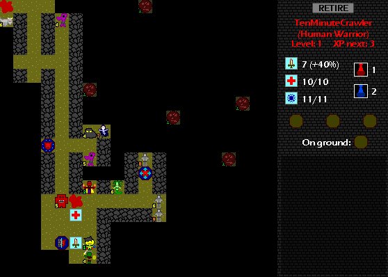
Early Desktop Dungeons screenie. NOT the work of someone who has any aesthetic taste.
I liked Bauhaus because it attempted to “trim” the idea of art in a way that was far more palatable for me. By taking a hard stance against ornaments, frills and general artistic fluff in my work, I was able to produce acceptable results as long as I oriented everything I did around minimalism. It probably wasn’t the perfect way to approach things and did limit my exploration of other thought schools such as Art Nouveau (much to the chagrin of my course lecturer) but it was certainly a useful piece of flotsam to cling to in a sea of vague and scary art stuff that I couldn’t fully comprehend.
By now, I’m hoping that some of the savvier game developers out there are already aware of what I’m pointing towards: minimalism in game design. It’s an important issue in the dev community (just run a quick check for minimalist game design on Google if you need convincing), and one which I’ve attempted to write about from time to time for places like Gamasutra.
Bauhaus is an excellent analogy for good game design precisely because it’s minimalist. Its determination to unite form and function (ideally to the point where the two become indistinguishable from one another) translates extremely well to tailoring a game’s ruleset for maximum efficiency, enjoyment and value.
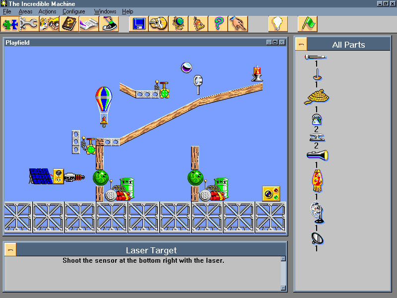
Not efficient. Though admittedly pretty darn fun anyway.
Consider this (rather ham-handed) example: you’re required to develop a box that is meant to hold something dangerous. From a Bauhaus perspective, there are several aesthetic ways to tailor this box: its shape may be altered to more safely hold the contents, its colour scheme could be adjusted to indicate danger, and even logos such as skulls and snakes may be justifiable additions. All of these could be considered “aesthetic” considerations, but they also work towards the box’s originally defined goal in a very real and important manner. A good designer should technically be able to make the box artistically appealing while remaining firmly grounded with what actually makes the box significant.
Additional artistic changes — such as putting a pink ribbon around the box — may make it more interesting to look at, but they’d be very difficult to justify. Is the ribbon useful? Does it add something to the box that was undeniably necessary? Why a ribbon specifically? In this scenario, if it merely ornaments the box, it is unacceptable.
Stupid ribbons.
A lot of beginners to game design — and probably to art in general — are obsessed with ornamentation. They see “pretty” game designs full of elements which appear to be a bunch of pink ribbons at face value, then immediately recreate those ribbons in their own games because they’re more concerned with how to add elements rather than why.
Consider Joe Developer, who has seen “bullet-time” get put to use in great games like Max Payne, and now wants to put it in his own game. Unfortunately, Joe Developer is busy creating his better-than-Starcraft real-time strategy magnum opus, which is probably a much less appropriate environment for such a dynamic. Imagine the irritation of players when they realise that their gaming experience regularly — and unnecessarily — slows down because their opponent keeps deciding to activate a “bullet time” shot from one of their units!
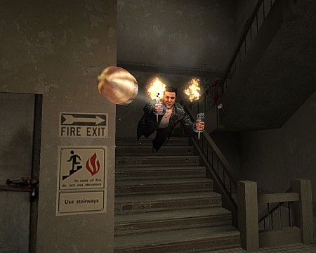
Bullet time in Max Payne was cool. But silly ol’ Joe Developer never took into consideration why it was cool, or what functionality it offered Payne players from a game rules perspective — the massive time luxury for correct aiming, the increased DPS and even the occasional opportunity for a super-massive-fast gun reload. The objective value of this gameplay was what players grew to respect, even if they were initially drawn towards its fun. And this happy marriage of fun and value was what made bullet time truly great! Lose either and you’ll have (according to Bauhaus wisdom) essentially screwed up. If an element of your game has no convincing function, it ends up becoming fluff at best and annoyance at worst — no matter how flashy and fun it may be at first.
Oh, and it’s also a remarkably efficient way to go down stairs.
The hypothesised scenario — constant bullet time slowdowns in Starcraft — is admittedly a horrendous and over-the-top mistake that no real dev is ever likely to make, but my point is that many of these blunders exist within games by adopting far more subtle and devious forms.
Even Desktop Dungeons can be accused of harbouring horrific (and distinctly un-Bauhaus) design crimes within the bowels of its game system. Consider the well-hated “gold grind” problem that veterans absolutely love poking at. The grind has fairly little use and doesn’t really present a meaningful decision or challenge for the player — it has devolved into a way to blow a few minutes of collection time between “real” dungeon runs. Which is a staggering pity, because we’re looking for ways to make persistent resources valuable between multiple dungeon runs — something that we already plan to do a lot better in the upcoming commercial version.
And hey, this design whoopsie is from a game which reviewer and personal journalism hero Kieron Gillen (squee!) actually describes as an intellectually respectable piece of design! Hah! As if!
I heart Kieron.
And that’s a “real-world” story (which, hey presto, has also just been useful as a Desktop Dungeons marketing wank — Bauhaus, yo), with consequences that really are affecting the player’s enjoyment negatively. Creating a game with sufficient depth that is nonetheless as simple as possible can be a really tricky task, one which becomes even trickier when the designer doesn’t realise why simplicity is important in the first place! What works for architects, sculptors, engineers and game designers alike is the determination to fill their works with as much purpose as possible, no matter what end it is that they are working towards.
To bring this post back its tentative first few paragraphs: games may or may not be art. Screw it, whatever. What matters is that they can definitely learn from art, and this is just my nooby little Bauhaus-centric take on the issue. My focus on function and minimalism is just a small part of the greater artistic landscape (and indeed, the idea of having to justify art could be absolutely horrific if viewed through a different lens), but it’s a starting point and a worthy topic of discussion.
Good design, whether it is from the canvas or the computer screen, is always going to be precisely that: good design. Its lessons can be applied anywhere.


